
Send help: I’m being absorbed by the landscape
 Share
Share
I’d suspected it for some time but now I’m sure of it: the Queenstown landscape is consuming me.
As if I’ve been given a circa-1994 intermediate school uniform, I now dress almost entirely in the colours of a Central Otago winter. Everything currently in my wardrobe is either black or some variation of brown, green or grey. In fashion language these terra-referencing colours probably have names like sand, lichen, schist or anthracite – but let’s call tussock a tussock: I’m becoming one with my surroundings.

'Everything currently in my wardrobe is either black or some variation of brown, green or grey...I’m becoming one with my surroundings' (Image: Facebook/Icebreaker).
I’m pretty sure it’s not just me unwittingly donning the uniform. I’ve noticed it happening to other Queenstowners too. Just watch people wandering on Steamer Wharf or crossing the Pak 'n Save carpark – they’d melt into a backdrop of the Crown Range Rd or Walter Peak, blend right into the surroundings up Wye Creek and maybe disappear altogether in Skippers Canyon. The colour palette of jerseys and coats at Altitude could be lifted straight from a digital marketing campaign for the Queenstown sights – or a local real estate listing for that matter, (more on houses later).
Watching the phenomenon unfold makes me think of that visual trope in westerns, where the characters (well, just the men really) appear to be inseparable from the landscape they're trying to gain dominion over.
“He rolled the cigarette in his lips, liking the taste of the tobacco, squinting his eyes against the sun glare. His buckskin shirt, seasoned by sun, rain, and sweat, smelled stale and old. His jeans had long since faded to a neutral color that lost itself against the desert.” - Louis L’Amour, Hondo
Western writers and filmmakers constantly work their characters into the landscape like this; it creates a sense of being at one with the land, of taming the wilderness in a place where hard people are trying to carve out a subsistence. Maybe in our wood-grain colour preferences, Queenstown is creating a sort of subgenre for ourselves, the alpine-tourist-western?
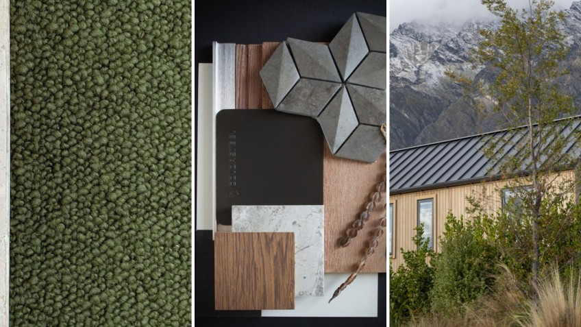
The terra-washing is not limited to clothing, either; look at the colours of Queenstown’s cars, company logos and interior design schemes. And if there’s one area where we’re single-mindedly fixated on landscape, it’s architecture.
Many of us live in recently developed zones where either covenant or convention stipulates a landscape-inspired colour palette – corrugate in shades like sandstone, scoria or slate, natural building materials, paint colours in “recessive tones” and so on.
The goal appears to be, in the language of architectural writing, a design that’s “sympathetic to the landscape”, “at one with its surroundings”, one that “echoes the natural environment” or at least “draws inspiration” from it. Just paying homage isn’t enough – we need our houses to almost disappear into the grand and glorious natural surroundings.
The rigorous and specific Jack’s Point guidelines, for example, demand subservience to the landscape, no less (I think nature would probably be quite grateful if we showed true subservience to it – maybe aesthetics is as good a place as any to begin work on that fraught relationship?).
There’s nothing wrong with colours and shapes that wash us into the landscape, of course. As Queenstown stretches out, these choices of homes that are “at home” in our environment are developing into a unique visual signature for our town. And in terms of capitalising on our natural assets, a design philosophy that positions geography as the first consideration is surely the way to go.
At the risk of sounding whiny though, I wonder if we have perhaps reached Peak Peaks when it comes to referencing Kawarau/the Remarkables in our commercial building designs? I love that craggy silhouette and velvety shadow play as much as the next Queenstowner, but I’m not sure I love the human interpretations. Dulling the complexity of that maunga and flattening it into building materials (over and over again) just seems kind of…obvious.
I suspect that at some point in the future, our subservience to the Queenstown landscape will start to feel juvenile. It already seems a bit superficial to be constantly referencing our most recognisable natural features, and as such, I hope there’s room for us to be known for something more in future.
As Queenstown grows into a city, will we grow out of this deference to the landscape? Is there room for another kind of reference point? What’s beyond our identity as a Beautiful Place?
I don’t know, I’m just a beech tree.
Main image (Left, Facebook/Bremworth Wool Carpets + Rugs, centre and right, Facebook/ColorSteel/Graham Warman): Many of us live in recently developed zones where either covenant or convention stipulates a landscape-inspired colour palette, says writer Jen Smart.


TOP STORIES