Otago Uni proposes rebrand with $670,000 price tag

An Otago institution is having a brand shake-up that will cost $670,000.
The University of Otago, the country's oldest university, has this week asked students, staff and alumni for their thoughts on a fresh logo and a new Māori name.
The consultation will cost $126,000 (included in the $670,000).
It's proposing to mostly ditch its coat of arms, gifted by Lord Lyon King of Arms (Scotland's premier officer of arms) in 1948 but informally in use since 1870, for a new tohu or symbol.
However the coat of arms will continue to be used in ceremonial settings such as graduations as well as in some locations.
The university says it has collaborated with mana whenua to come up with the design as well as the new Māori name that will sit alongside the official University of Otago name, which isn't changing.

The current logo for the University of Otago draws on the district's blue and gold, is a nod to the city's Scottish heritage, and includes the university's motto.
The proposal includes changing the current Māori name from Te Whare Wānanga o Otāgo to Ōtākou Whakaihu Waka – a metaphor meaning A Place of Many Firsts.
The university's motto will continue to be "Sapere Aude", a Latin phrase meaning "Dare to be wise", but it will no longer appear on the logo.
Initial opponents to the brand change are questioning the big spend on what some argue is essentially a corporate identity, at a time when students and staff are feeling the pain of a cost of living crisis and the university itself is running on a deficit budget, with a falling staff headcount.
Pre-empting such sentiments, the university communications around the rebrand say costs will be met within existing budgets.
"This is seen as a prudent expenditure to work towards the future we are seeking, with the costs spread over a number of years."
In a statement yesterday, acting vice-chancellor Professor Helen Nicholson acknowledges the proposal is a bold change for the university.
“In choosing to consider this path, we have reflected our proud history full of transformation, of daring, of choosing to be an institution which prizes education and community, and of doing the right thing rather than the easy thing.
“We want to be a New Zealand university which welcomes all people and works together to help them succeed. We want to reflect modern Aotearoa New Zealand and continue to lead at the forefront of our nation’s progress. And we want our visual identity which speaks to our unique and special place in the world,” she says.
Last month, the university launched Vision 2040 - a new strategic direction for the more than 150-year-old institution.
"At the heart of this long-term plan is the desire to become a Te Tiriti-led organisation, working in partnership with mana whenua," the university says in yesterday's statement.
Professor Nicholson says hard work will be needed to see this vision achieved, and the new logo and Māori name are just one step in a process..
“Our desire for a new identity is just one part of what we believe needs to happen over the coming decade and a half,” she says.
Vision 2040 comes after a 2022 report into culture at the university flagged many significant issues, particularly around racism and culture.
So, what does it all mean?
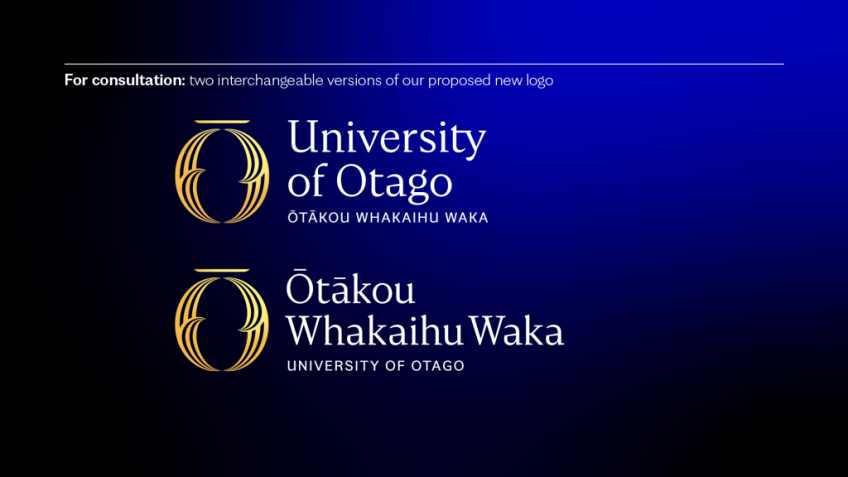
The proposed tohu is a representation of the Ōtākou channel, in Otago Harbour, which brings water, kai and life to and from the region – just as the university brings and shares knowledge across Aotearoa, the university says.
"The tohu is in the shape of an 'O', or circle, with a macron, or line, above. The ends of the macron are angled so that it resembles the shape of a waka. The 'O' consists of two crescent-shaped halves.
"Each half of the tohu is formed by three lines, which narrow and meet in a point at the top and the bottom of the tohu, where the two halves meet each other. Each half also has a stroke that curves inwards, into a point emerging from the inner edge of the crescent. On the left half, this point curves upwards and in towards the centre of the tohu; on the right half it curves downwards and in.
"The tohu is gold, with a dark blue background."
On its website, the university says its brand is more than just a logo.
"A brand is the essence of our own unique story", and it needs to be represented in a constant and authentic way, it says.
The consultation period runs from Wednesday, March 15 to Sunday, April 16, following which the University Council will make a decision on whether to progress with the proposed changes.
Main image (University of Otago): The proposed new logo options for the University of Otago, which come with a $670,000 price tag.


